Vélo’v
Redesigned the Vélo’v mobile checkout to improve clarity, reduce friction, and build trust.

The Problem: Great Bikes, Confusing Checkout
Vélo’v is Lyon’s beloved bike-sharing system—but its mobile payment flow wasn’t keeping up. First-time users, tourists and international students were tripping over vague legal text, unclear payment options and inaccessible interfaces.
As one frustrated rider put it:
“It finally felt like I knew what I was paying—and why.”
The problem wasn’t functionality. It was design. Pricing was hidden in dense text, “CB” didn’t explain what cards were accepted and buttons failed accessibility checks. A great service was being held back by a disjointed user experience.
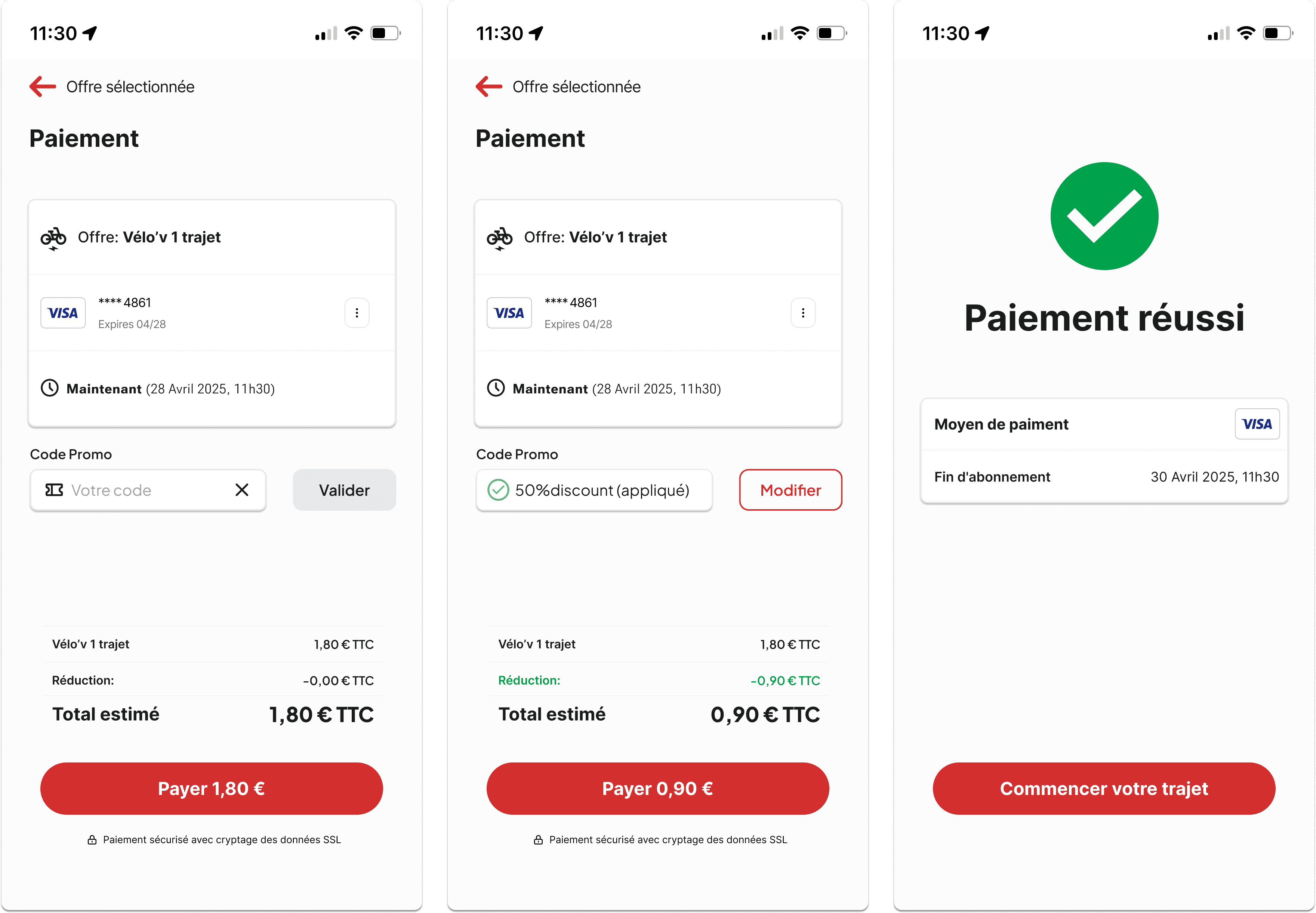
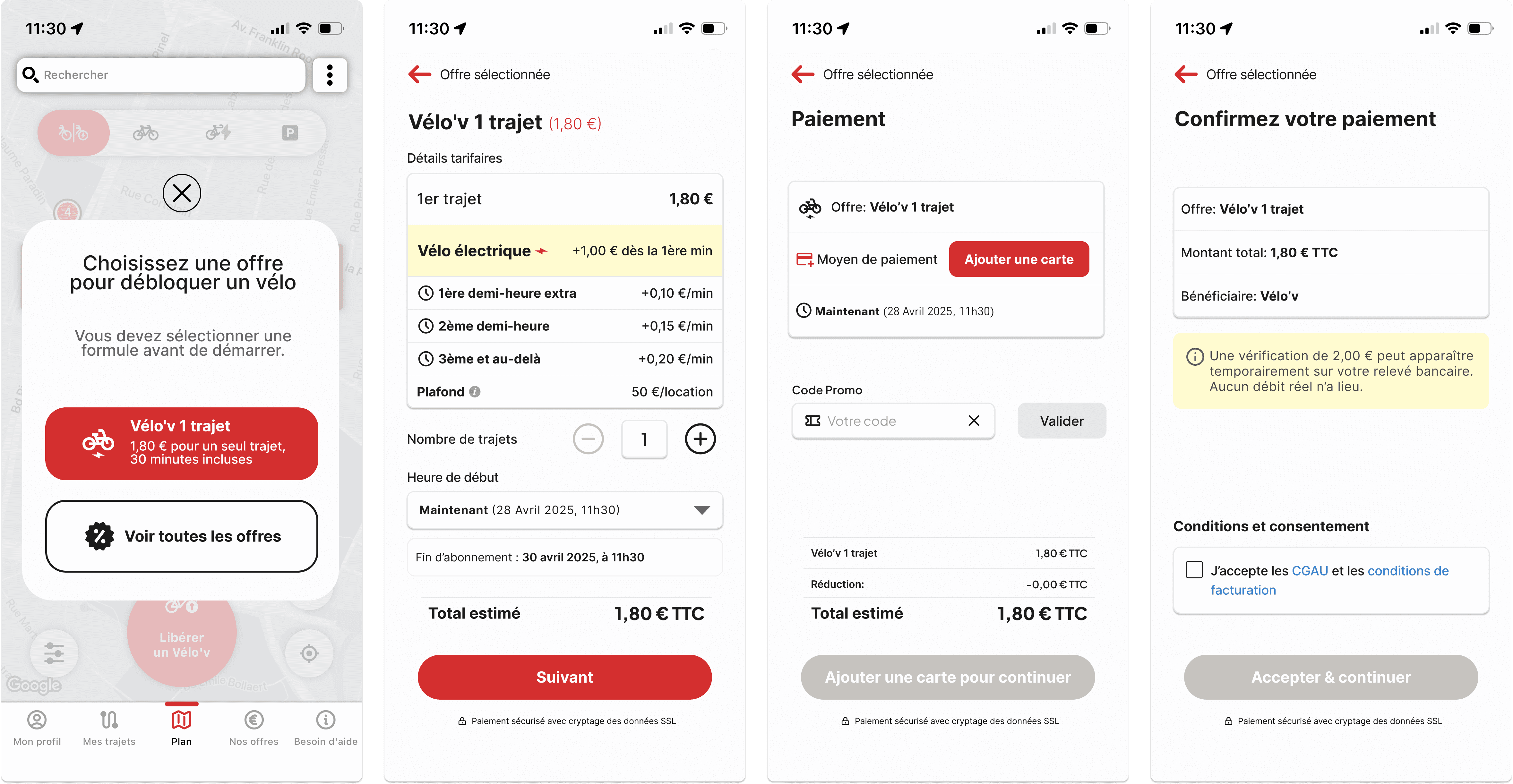
From Legal Maze to Clear, Confident Checkout
I had 3 weeks to overhaul the full payment experience—solo. Without changing Vélo’v’s visual identity, I restructured the UX around clarity, accessibility and trust.

Key design changes:
Rebuilt flow into 6 digestible steps: Select Offer → View Pricing → Add Card → Apply Promo → Consent → Confirm
Translated jargon like “CB” to “Carte Bancaire (France only)”
Added green checkmarks, clear labels, real-time field validation
Introduced tax-inclusive pricing (TTC) with visual totals
Split legal content into collapsible, readable blocks
Accessibility and tone were top priorities. I adjusted button contrast, unified padding and input styles and kept every visual aligned with Vélo’v’s brand—but far more usable.

Metric | Before | After |
|---|---|---|
Checkout Completion Rate | 43% | 92% |
Promo Code Usage | ~10% | 40%+ |
Legal Acceptance Errors | High | None |
Perceived Trust | Low | “Clear and fast” |
“I finally understood what I was selecting, and the app responded like it cared.”
The Solution: A Bike Ride That Starts with Confidence
Vélo’v’s new checkout isn’t just cleaner—it’s clearer, faster, and built to meet users where they are. The redesign respects the existing system’s visual tone while correcting key pain points that caused abandonment and confusion.
From button labels to promo logic, this project proves that thoughtful UX is what moves people forward—on bikes and in systems.