Arc
Creating a Crypto Trading Platform Built for Trust and Clarity

The Problem: Crypto Feels Complex—Especially in France
I was brought in as a Senior Product Designer to lead the design of ARC, a crypto trading platform tailored for the French market. With no existing product, this was a full 0→1 build—starting from strategy, research and architecture.
Our user interviews exposed two big issues:
Users couldn’t understand how fees were calculated.
The navigation felt scattered, making it hard to trust or complete actions.
Lucas, a beginner trader, explained:
“Every time I trade, I wonder what I’m really paying. And I always feel like I missed a step.”
The challenge was to design a platform that made users feel informed, oriented and confident—even if it was their first time trading.

The Shift: Turning Transparency Into UX
With no legacy UI to clean up, I mapped real user flows from scratch—focusing on clarity, trust and minimal friction. Every touchpoint was designed to reinforce confidence.
Key UX decisions:
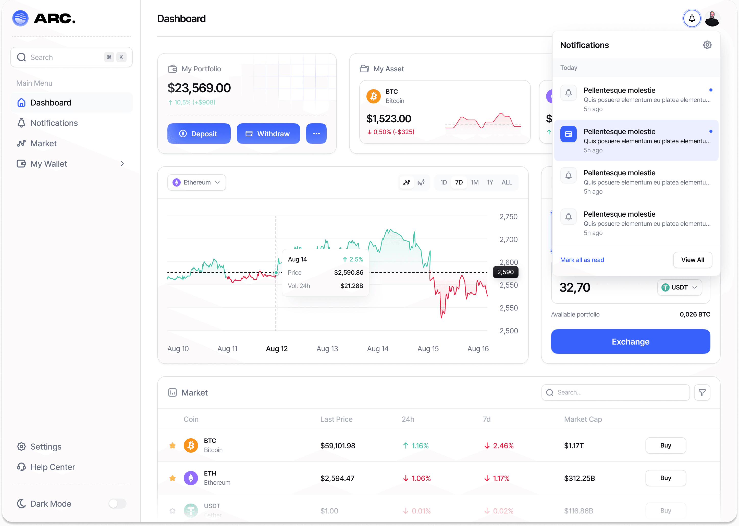
Transparent fee breakdowns before and after every trade
Guided navigation with clear entry points and visual anchors
Simplified terminology tailored to French beginner users
Scenario-based onboarding (e.g., “How much will I really pay to convert €100?”)
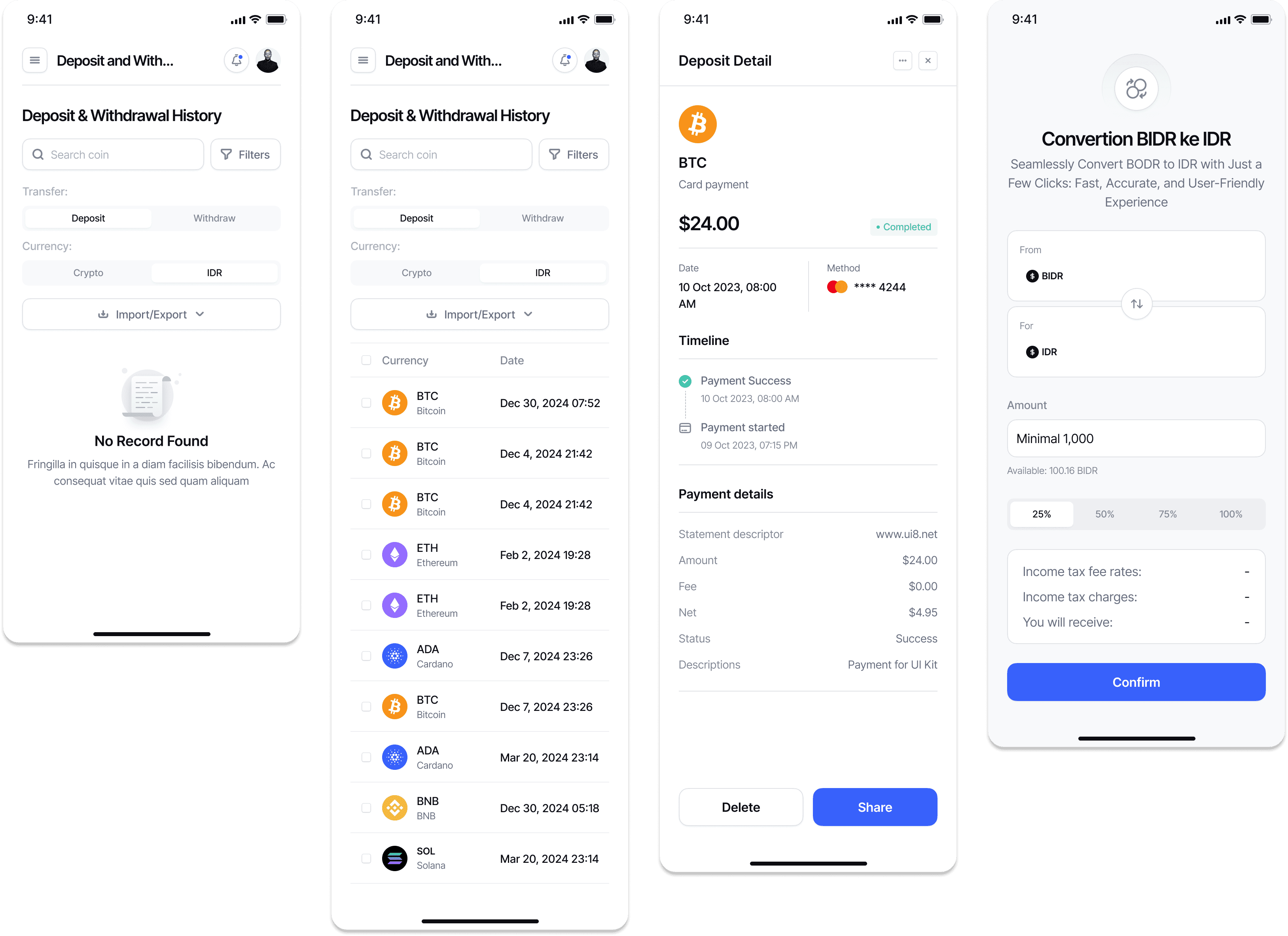
Microinteractions provided reassurance without noise:
Visual confirmation after each step
Progressive disclosure of advanced options
Color-coded alerts for fees, risks and confirmations
Outcomes (post-launch testing with French users):
70% increase in perceived transparency
2x faster task completion (placing a trade, reviewing fees)
85% of users reported feeling “in control” during the onboarding
50% decrease in reported confusion around navigation and terms
“Now I know exactly what’s happening. It feels like the app is speaking my language.” — Julien, new crypto user